Enterprise Command Centers (ECC) provide information discovery along with visualization and exploration capabilities embedded within Oracle E-Business Suite user interfaces. Oracle Enterprise Command Center Framework enables the creation of business dashboards in different functional areas. Oracle E-Business Suite users navigate transactional information using interactive visual components and guided discovery capabilities allowing exploratory data analysis. Mobility and responsive design are built into the Oracle Enterprise Command Center Framework, and all dashboards automatically adjust the layout to better fit a desktop or mobile device form factor. Oracle Enterprise Command Center Framework automatically adheres to existing Oracle E-Business Suite security. The dashboard content a user sees is completely consistent with the Oracle E-Business Suite context and security.
Example of an Enterprise Command Center Dashboard

Each Enterprise Command Center has a set of features that allows users to answer essential questions, uncover business insights, and drill down to take the relevant action. It helps users quickly and intuitively analyze data so they can make confident decisions driven by data.
Search
Oracle Enterprise Command Center Framework comes with search capabilities that allow users to search for a term within a particular data. To do a basic search, type your search term into the search box then a list of attribute values containing the search terms is displayed, and you can select a value from the list to search for it or click on the magnifying glass (search icon) to retrieve all records containing this value.
Search Box Example
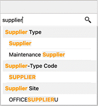
The Search box supports the following capabilities:
-
Look and Feel: The search box appears at the page level instead of in the side navigation panel. This look and feel provides easy-to-read search term highlighting and keyboard navigation for the auto-suggestion list.
-
Multi data set: In the products where the search box is configured with more than one data set, the user can switch among the data sets to search for values from each data set and apply as filters. Name of the selected data set appears on the component header.

Selected Refinements
The Selected Refinements region allows you to view and understand how the applied filters are displayed and grouped based on refinement operator.
In the Selected Refinements region, filters are grouped as described below:
-
With the same attribute and same operator, filters are displayed in the same accordionExample of the Same Attribute and Operator in Selected Refinements
-
With the same attribute but different operators, filters are displayed in different accordions
Data Visualization
Oracle Enterprise Command Center Framework has a set of graphs and charts that provide a powerful way of summarizing and presenting data that are critical in decision making in an easily comprehended manner. You can find insights, detect outliers, filter the data directly from the charts, and drill down to a deeper level of details. The following examples show how charts and graphs are used to detect and solve several problems or highlight bottlenecks and exceptions.
Summarization Bar
As the name implies, metrics, flags and dimensions in the bar summarize important aspects of the data displayed. All values are updated with new calculation results when you change the focus as you filter the data.
The summarization bar supports conditional formatting. With conditional formatting, a metric item can be displayed in a specific color based on a specific value or range of values, so that the color changes depending on the value of the metric.
Summarization Bar Example
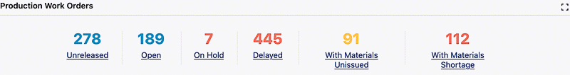
You can apply a filter from a metric item in the summarization bar; this filter can be based on static condition. For example, "Draft Orders" based on conditions (open flag = Y AND booked flag = N). Also, the filter can be based on a variable condition. For example, "My SRs" metric is based on service requests assigned to the logged-in user. In this case, the condition is changing based on the logged-in user.
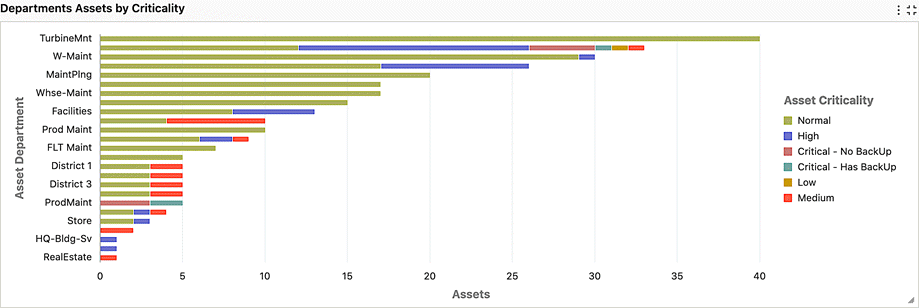
Charts
Charts depict data trends, distributions, anomalies, and more. You can drill down through different levels of hierarchy and allow the system to expose different levels of details dynamically. You can control which options to slice the data by and affect the whole navigation path by picking filters directly from the charts.
Charts are effective when there is numerical data that splits nicely into different categories so you can quickly see trends within the data, compare related information, and gain immediate insight.
Example of a Bar /Bar Line Chart
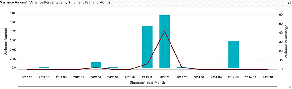

You can refine the displayed data by clicking the data point on the chart. Also, by hovering the mouse over a chart, you can display the dimension and metric value for a data point.
Also, you can make the following refinements:
- Click a data point on the chart to refine the data by all of the applicable dimension values
- Click a label on the category axis to refine the data by that value only
- Click a legend entry to refine the data by that value only
Pie and Donut Charts
Pie charts show a single metric aggregated across a group dimension.
Example of a Donut Chart
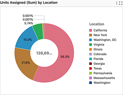
You can hover the mouse over a wedge or segment to display the corresponding metric value as well as its percent of the total.
Scatter Chart
Scatter Chart Example
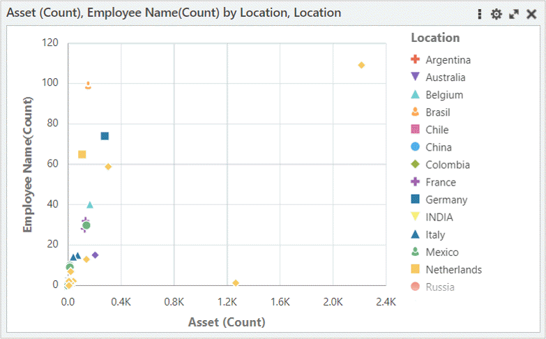 A scatter chart is used to plot two metrics against each other. Scatter charts are used to find clusters of data points, to show gaps, and to identify sub-populations. Example use cases include cause and effect analysis (a driving factor and a dependent one), or analysis of the correlation of two variables, for example, the analysis of the relationship between cash inflow and outflow per project.
You can define the dimensions of the data used in the scatter chart. The group dimension (for example, location) controls the shapes of the data point display. The series dimension controls the number of data points with a particular shape. A data point is displayed at the intersection between the
x and y metrics. Bubble Chart
Bubble Chart Example
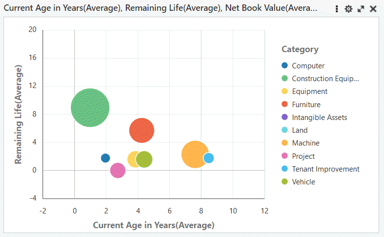 A bubble chart is used to plot two metrics against each other with an additional metric represented as the bubble size. Bubble charts are used to show concentrations of data along two axes with magnitude. For example, they could be used to illustrate performance review ratings or customer profitability.
You can define the dimensions of the data used in the bubble chart. The group dimension controls the bubble color. The series dimension controls the number of bubbles with the same color. A data point is displayed at the intersection between the
x and y metrics. Reference Line
Example of a Reference Line in a Chart
A reference line in a chart can be used to identify a specific value on a chart axis. The value can be based on a function, such as the average, maximum, or minimum. It is a constant value. The reference line is available only for a defined metric; for example, Invoice Amount (sum).
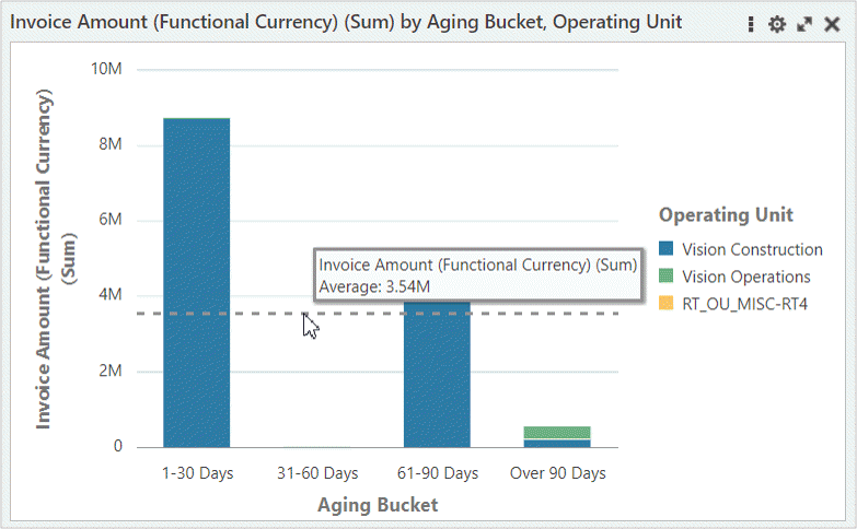 You can add more than one reference line to a chart. You can add a separate line for each metric defined, or you can add several reference lines for the same metric, using different functions associated with each one.
Reference lines are supported in all types of charts except pie and donut charts.
Tag Cloud
A tag cloud highlights keywords in the system based on a configured importance metric. For example, a tag cloud could show top (or bottom) suppliers by invoice count, invoice amounts, and so on.
Example of a Tag Cloud
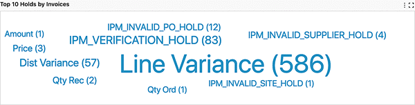
You can change the attributes of the Tag Cloud by using the Options icon.
Detailed Insights
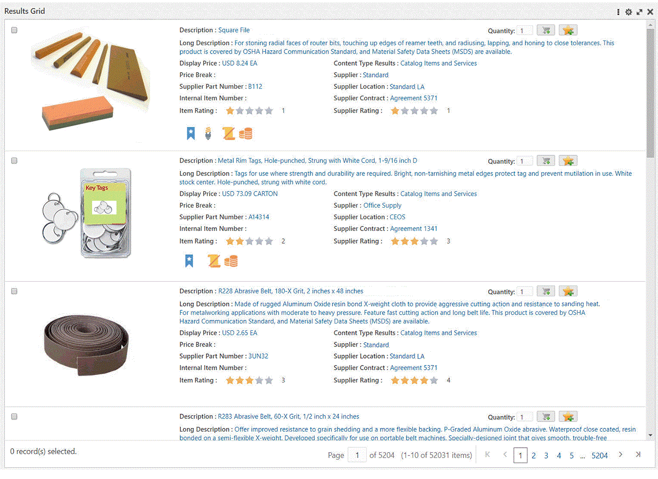
Oracle Enterprise Command Centers can offer detailed insights into the data through results tables and grids which help you gain insight as quickly as possible. You can then act on it by taking the required action to resolve a process bottleneck or address an exception.
On some results tables and grids you can use the Options icon to compare records or perform other functions.
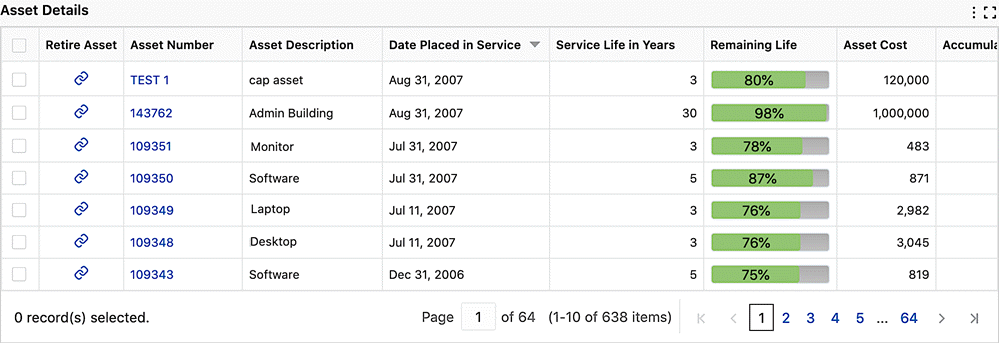
For record search only, you can control the order of the search results based on the record score in the data set. Data is sorted by "Score" by default. You can override this default order or add more sort options when you configure a dashboard. This ranking is supported only in results tables and grids.
A results table displays 10 records per page by default, and when expanded, it displays 50 records per page.
Grid functionality includes the following:
- Runtime Sorting: Business users can sort by any attribute displayed at runtime.
- Pagination Control and Selection: Pagination control and record selection can be removed from a grid to support additional business use cases for the grid.
- Text Formatting: You can change the text style, alignment, size, and color.
Example of a Grid
You can compare records in a results table or grid. The Compare pop-up also allows you to compare among the records view information of attribute values. Attributes are organized into corresponding groups if configured.
Compare pop-up can also have dynamic titles as column headers. An aggregated table displays aggregated metrics in tabular format. The aggregation level is controlled by all dimensions displayed in the table. Examples of aggregated tables include the comparison of the financial information of multiple assets, or the comparison of account balances.
Grid actions can also be accessible from the column headers of the pop-up.
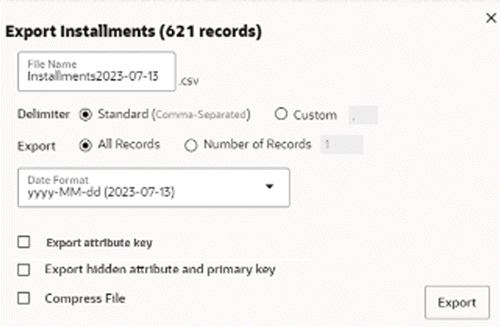
Records in results table and results grid can be exported in a CSV file format. The exported file contains records organized in a tabular structure with attribute keys and attributes names as table headers. The exported file also contains selected refinements on the page and timestamp of export. To Export:
- Click Export in runtime options to open a pop-up with export options.
- Choose standard or custom delimiter.
- Choose the Attributes to export.
- Choose the number of records.
- Choose if hidden attributes and primary key needs to be included.
- Choose if the file needs to be compressed.
Example of an Export Pop-Up Window